Expressing a brand’s outdoor-friendly philosophy by building with wood
Vancouver, BC
The Mountain Equipment Co-op (MEC) store in Vancouver, the birthplace of MEC, is the 10th and latest of a family of new locations across Canada completed over the past five years. When the Co-op chose to refresh its brand, integrating a new logo, the company also embarked on the creation of a distinct architecture for its buildings. The new stores adapt regionally while carrying common elements, identifying them as a cohesive expression of the MEC brand.
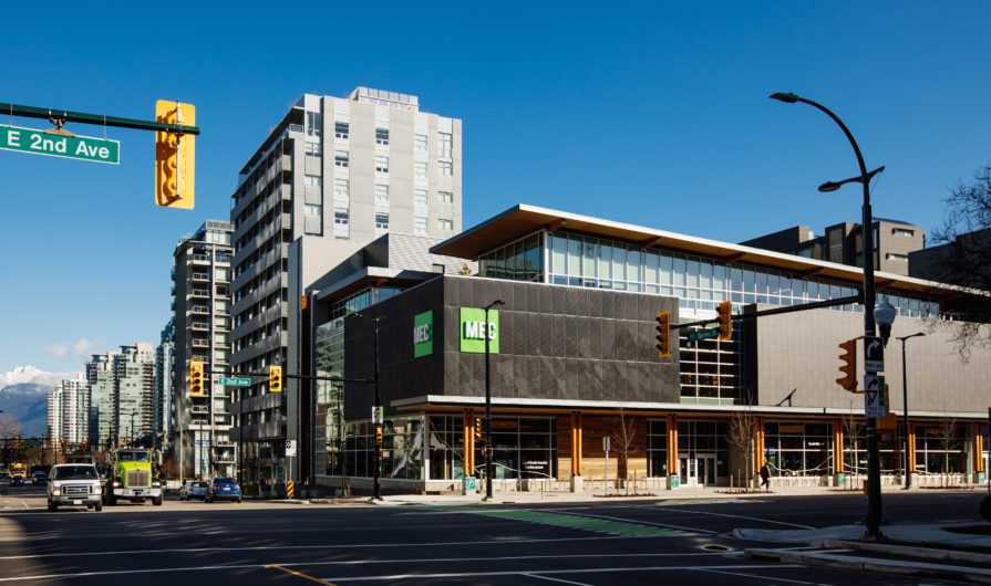
The latest store was envisioned to be a leader of the family, a flagship store expressing MEC’s ideals and its focus on innovation. The three-storey mass timber building designed by Proscenium Architecture & Interiors (with interior retail design by Aedifica Architecture + Design) embodies MEC’s signature green building agenda and acts as a gateway marker to the relatively new Olympic Village neighborhood.
The store has been designed to achieve a minimum of LEED Gold certification. A high-performance building that uses almost one-third less energy compared to standards set out by the national energy code, the building envelope provides thermal barriers of R50 and R40 for the roof and walls. Innovative wastewater technologies, such as waterless urinals and grey-water-fed toilets, reduce potable water use by depending on rainwater collected in cisterns, fed from a blue roof surrounded with sloping green roofs. Careful management of the building’s stormwater runoff has resulted in a rainwater system designed to support local habitats through water quality, flow rate, volume and duration – contributing factors to the building’s Salmon Safe certification. As part of the Olympic Village, the store was required to connect to the False Creek Neighbourhood Energy Utility (NEU), but – unlike most buildings in the area – MEC’s efficiencies allow it to sell excess energy back to the system.
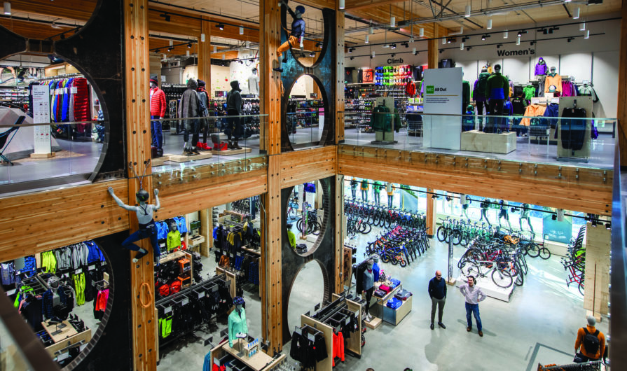
From client through consulting and construction teams, the project was conceived as MEC’s third mass timber structure; not just for the beauty of wood but for timber’s inherent sustainability. As a renewable, regional building material that comes with the added benefit of storing carbon and supporting reuse at the end of its life, wood construction dovetails neatly with MEC values. In the MEC Vancouver store, the wood structure is fully expressed. Due to tall floor-to-floor heights, the glulam column and beam system emphasizes verticality in the spacious retail interiors as it draws the eye to the seven-ply CLT floor structure. At the heart of the space is a double-height atrium that connects the two retail levels via a feature stair that bridges the opening. Seismic resistance is furnished with raw steel brace frames displayed in series – standout curved forms in a predominantly rectilinear space, which are affectionately referred to by the project team as the Omega Braces. The use of raw steel is a thematic material expression utilized on the store’s feature stair, and also at the majority of the new stores across the country.
The site and the zoning policies associated with the Olympic Village neighborhood strongly influenced the building’s exterior expression. The junction where it’s located is seen as a gateway to the neighborhood, and as such needed a marker that would distinctly identify this intersection. In addition, to add vibrancy to the street edge experience, it became apparent that there needed to be a visual connection between the pedestrian realm and the retail interior. This led to ground-floor transparency where traditionally a large-format store would be more inwardly focusing, eschewing perimeter glazing for wall shelving opportunities. Throughout the neighborhood, lanes are not treated as a traditional back-of-house experience; they are secondary streets and have residential townhomes fronting on them, with high-rise towers over top. The zoning policy also calls for physical midblock connections through the neighborhood, which presented challenges for a single-tenant retail floor.
These constraints essentially meant that all faces of the building, including the roof, would be highly visible; a typical back-of-house loading with a standard flat roof plane was not an option. Instead, ample ground-level glass at the street edge creates a visual connection to the store interior, expressing the mass timber structure. A generous wood soffit/column canopy runs the length of the building, marking the entry and utilizing an architectural language common to new MEC stores. An ombre wall system of bent metal discs creates an image of a B.C. mountain range anchoring the corner. Where the building meets the sidewalk and integrated bike path, a linear Corten planter abuts the board-form concrete below the glass line; the lane elevation is treated with a system of stepping Corten planters and a vertical climbing screen/vine system. The building siding breaks in line with the neighboring through-block connection, axially aligning a vertical glass slot through the building to visually continue the urban design gesture and providing a dramatic glazed backdrop to the feature stair.
Exterior cladding materials are chosen to tie the building to other MEC stores and applied strategically to break up the massing of the second floor. The third-floor steps back along the south and north sides to create roof decks for the third-floor offices and a break in the street wall. The solid massing of the retail second floor reverts to glazed transparency for the third-floor offices, capped by the overhangs of the sloped wood structure of the roof.
MEC’s goal for the building was to design a flagship store that captures the outdoor spirit at the heart of the MEC community. Due to its location adjacent to cycling paths, the running route of the seawall and available kayaking on False Creek, the store benefits from the energetic and active environment literally all around it. The architectural expression, with its sloping green roofs, blurring of the indoor-outdoor experience, tall wood structure and images of the mountains beyond speaks to MEC’s outdoorsy spirit and acts as a perfect gateway and addition to the lively neighborhood.
CLIENT
Beedie Group
Vancouver, BC
ARCHITECT
Proscenium Architecture + Interiors
Vancouver, BC
STRUCTURAL CONSULTANT
Fast + Epp
Vancouver, BC
General Contractor
Heatherbrae Builders
Richmond, BC
Project Manager
Green Building Consulting
Revelstoke, BC
Retail Design
Aedifica Architecture + Design
Montreal, QC
PHOTOGRAPHY
Michael Elkan (exterior)
Vancouver, BC
Kori Chan (interior)
Vancouver, BC

